Matplotlib
Table of Contents
1. Matplotlib 简介
Matplotlib 是 Python 的一个绘图库。它的 Gallery 页面中有很多实用例子,并且带有源程序。
参考:
Matplotlib documentation: http://matplotlib.org/contents.html
1.1. 查看帮助文档
使用 help 可以查看相关模块或函数的帮助文档。如:
>>> import matplotlib.pyplot as plt
>>> help(plt)
Help on module matplotlib.pyplot in matplotlib:

NAME
    matplotlib.pyplot - Provides a MATLAB-like plotting framework.

FILE
    /System/Library/Frameworks/Python.framework/Versions/2.7/Extras/lib/python/matplotlib/pyplot.py

DESCRIPTION
    :mod:`~matplotlib.pylab` combines pyplot with numpy into a single namespace.
    This is convenient for interactive work, but for programming it
    is recommended that the namespaces be kept separate, e.g.::

        import numpy as np
        import matplotlib.pyplot as plt

        x = np.arange(0, 5, 0.1);
        y = np.sin(x)
        plt.plot(x, y)
:
>>> help(plt.plot)      # 这里省略了输出
>>> help(plt.show)      # 这里省略了输出
2. pyplot 实例
Matplotlib 的 pyplot 子库提供了和 MATLAB 类似的绘图 API,方便用户快速绘制 2D 图表。
参考:
Plotting commands summary: http://matplotlib.org/api/pyplot_summary.html
Pyplot tutorial: http://matplotlib.org/users/pyplot_tutorial.html
2.1. 几个简单例子
下面是 pyplot 的简单例子。
# -*- coding: utf-8 -*-
import matplotlib.pyplot as plt
plt.plot([1,4,9,16])            # 这里省略了 x 值,和 plt.plot([0,1,2,3], [1,4,9,16]) 相同
plt.ylabel('some numbers')      # 定制 y 轴标签
plt.show()                      # 显示图形
生成的图片如图 1 所示。
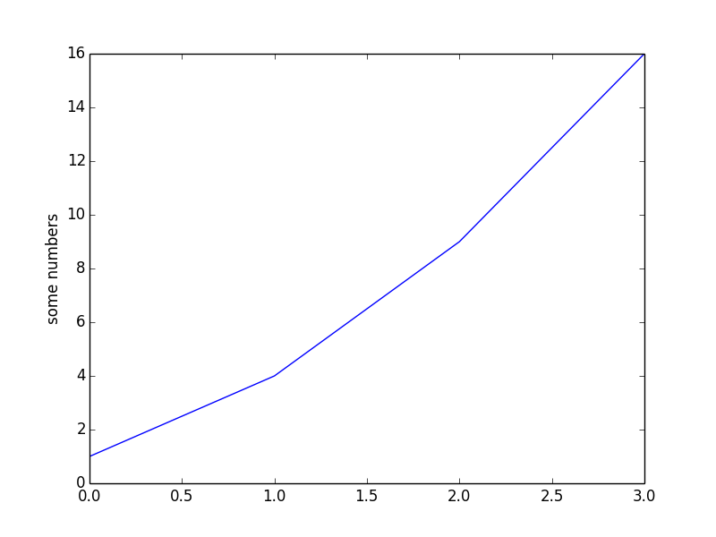
Figure 1: plot([1,4,9,16])
上面例子中, plt.plot([1,4,9,16]) 的作用和 plt.plot([0,1,2,3], [1,4,9,16]) 是一样的,即在图片上画 4 个点,不过 plot 默认会把点连接在一起。我们可以通过 plot 的第 3 个参数控制线条的颜色和格式,如 'ro' 表示“红色”和“圆点”:
# -*- coding: utf-8 -*-
import matplotlib.pyplot as plt
plt.plot([0,1,2,3], [1,4,9,16], 'ro') # 'ro' 表示显示格式为“红色”和“圆点”
plt.axis([-1, 4, 0, 18])              # 控制坐标轴的显示范围,格式为 [xmin, xmax, ymin, ymax]
                                      # 也可对x,y分别控制,即plt.xlim(-1, 4); plt.ylim(0, 18);
plt.ylabel('some numbers')
plt.show()
生成的图片如图 2 所示。
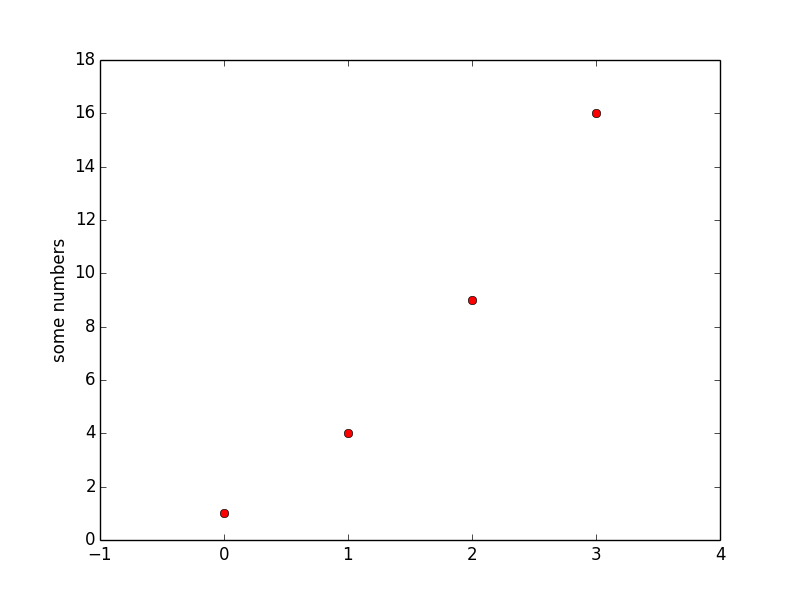
Figure 2: 和图 1 一样,不过定制了显式格式,及坐标轴范围
2.2. 一个坐标上画多个图形
用一个 plot 命令可在一个坐标上同时画多个图形。
# -*- coding: utf-8 -*-
import numpy as np
import matplotlib.pyplot as plt

# evenly sampled time at 200ms intervals
t = np.arange(0., 5., 0.2)

# red dashes, blue squares and green triangles
plt.plot(t, t, 'r--', t, t**2, 'bs', t, t**3, 'g^')     # 同时画了三个图形,并指定不同样式
plt.show()
生成的图片如图 3 所示。
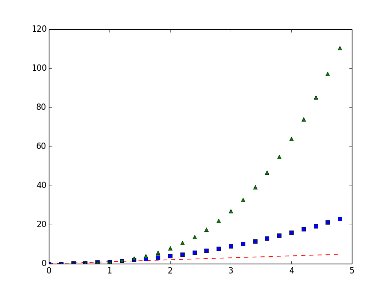
Figure 3: 一个 plot 命令可同时画多个图形
2.3. 子图形窗口(subplot)
利用 subplot 命令,可以在一个图片中显示多个子图形窗口。
# -*- coding: utf-8 -*-
import numpy as np
import matplotlib.pyplot as plt

def f(t):
    return np.exp(-t) * np.cos(2*np.pi*t)

t1 = np.arange(0.0, 5.0, 0.1)
t2 = np.arange(0.0, 5.0, 0.02)

plt.figure(1)                 # 可省略
plt.subplot(211)              # 共有2行1列,当前是第1个子图。也可以写为 plt.subplot(2,1,1)
plt.plot(t1, f(t1), 'bo', t2, f(t2), 'k')

plt.subplot(212)              # 共有2行1列,当前是第2个子图。也可以写为 plt.subplot(2,1,2)
plt.plot(t2, np.cos(2*np.pi*t2), 'r--')
plt.show()
生成的图片如图 4 所示。
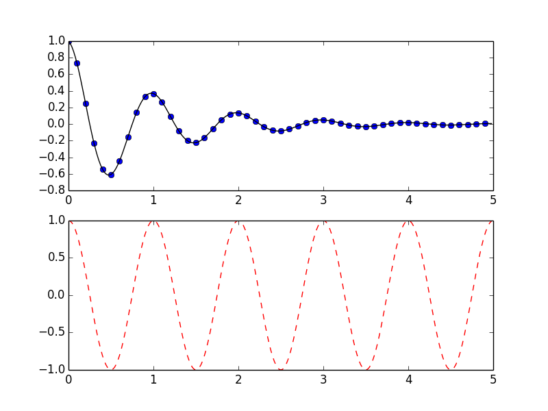
Figure 4: subplot 实例
2.4. 图片中增加文字说明(text)
使用 text 命令可以在图片指定位置增加文字说明。
# -*- coding: utf-8 -*-
import numpy as np
import matplotlib.pyplot as plt

# Fixing random state for reproducibility
np.random.seed(19680801)

mu, sigma = 100, 15
x = mu + sigma * np.random.randn(10000)

plt.hist(x, 50, normed=1, facecolor='g', alpha=0.75)  # 画直方图

plt.xlabel('Smarts')
plt.ylabel('Probability')
plt.title('Histogram of IQ')
plt.text(60, .025, r'$\mu=100,\ \sigma=15$')          # 在(60, 0.025)处显示指定文字 r'$\mu=100,\ \sigma=15$'
plt.axis([40, 160, 0, 0.03])
plt.grid(True)                                        # 显示网格
plt.show()
说明:The r preceding the title string is important – it signifies that the string is a raw string and not to treat backslashes as python escapes.
生成的图片如图 5 所示。
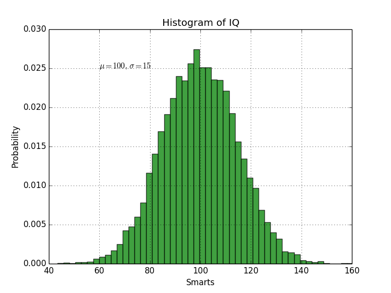
Figure 5: 在(60, 0.025)处显示指定文字
2.4.1. 添加箭头等标记(annotate)
使用 annotate 可以更方便地增加箭头等标记。
# -*- coding: utf-8 -*-
import numpy as np
import matplotlib.pyplot as plt

ax = plt.subplot(111)

t = np.arange(0.0, 5.0, 0.01)
s = np.cos(2*np.pi*t)
line, = plt.plot(t, s, lw=2)

plt.annotate('local max', xy=(2, 1), xytext=(3, 1.5),
             arrowprops=dict(arrowstyle="->",connectionstyle="arc3"))
# 其中,xy是箭头所指位置,xytext是起点,arrowstyle指定箭头的样式

plt.ylim(-2,2)
plt.show()
生成的图片如图 6 所示。
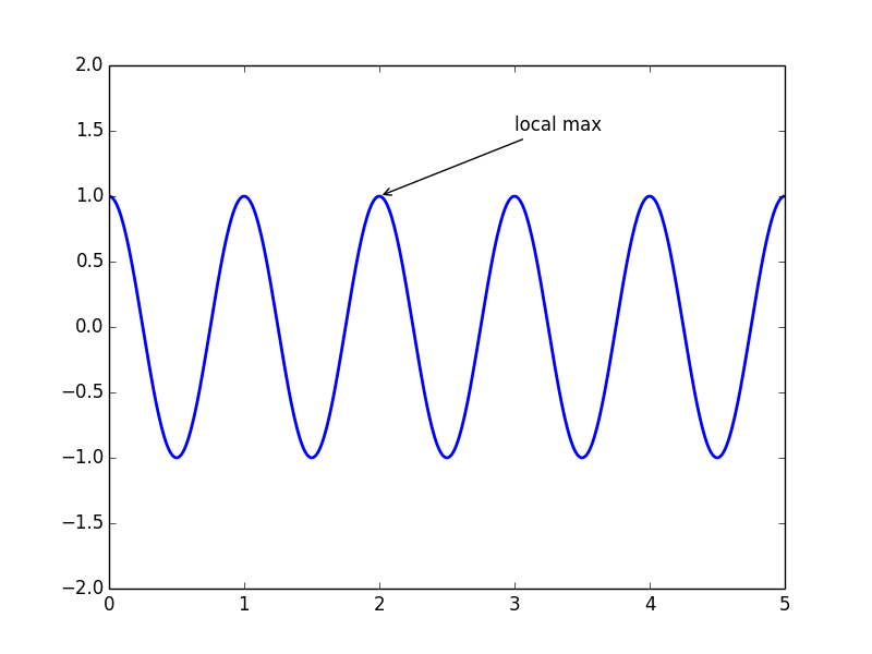
Figure 6: 使用 annotate 增加标记的例子
2.5. 标题、坐标标签和图例
下面是在图片中显示“标题、坐标标签和图例”的例子。
# -*- coding: utf-8 -*-
import numpy as np
import matplotlib.pyplot as plt

x = np.linspace(0, 2 * np.pi, 50)   # 生成包含50个元素的数组,它们均匀的分布在[0, 2pi]的区间中
plt.plot(x, np.sin(x), 'r-x', label='Sin(x)')
plt.plot(x, np.cos(x), 'g-^', label='Cos(x)')
plt.legend()                        # 显示图例
plt.xlabel('Rads')                  # 显示x轴标签
plt.ylabel('Amplitude')             # 显示y标签
plt.title('Sin and Cos Waves')      # 显示标题
plt.show()
生成的图片如图 7 所示。
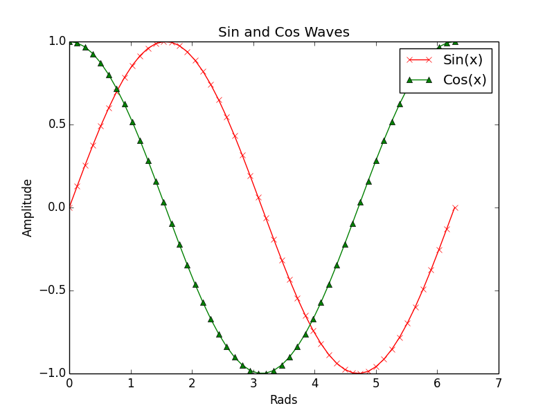
Figure 7: 显示“标题、坐标标签和图例”的例子
2.6. 对数坐标画图
对数值的范围跨度比较大时,我们往往会使用对数坐标。
2.6.1. xscale, yscale
使用 xscale, yscale 可以对坐标轴进行伸缩,从而实现对数坐标。
# -*- coding: utf-8 -*-
import numpy as np
import matplotlib.pyplot as plt

# Fixing random state for reproducibility
np.random.seed(19680801)

# make up some data in the interval ]0, 1[
y = np.random.normal(loc=0.5, scale=0.4, size=1000)
y = y[(y > 0) & (y < 1)]
y.sort()
x = np.arange(len(y))

# linear
plt.subplot(221)
plt.plot(x, y)
plt.title('linear')
plt.grid(True)

# logarithmic y axis
plt.subplot(222)
plt.plot(x, y)
plt.yscale('log')                   # 设置y轴为对数坐标
plt.title('logarithmic y axis')
plt.grid(True)

# logarithmic x axis
plt.subplot(223)
plt.plot(x, y)
plt.xscale('log')                   # 设置x轴为对数坐标
plt.title('logarithmic x axis')
plt.grid(True)

# logarithmic x and y axis
plt.subplot(224)
plt.plot(x, y)
plt.xscale('log')                   # 设置x轴为对数坐标
plt.yscale('log')                   # 设置y轴为对数坐标
plt.title('loglogarithmic x and y axis')
plt.grid(True)

plt.show()
生成的图片如图 8 所示。
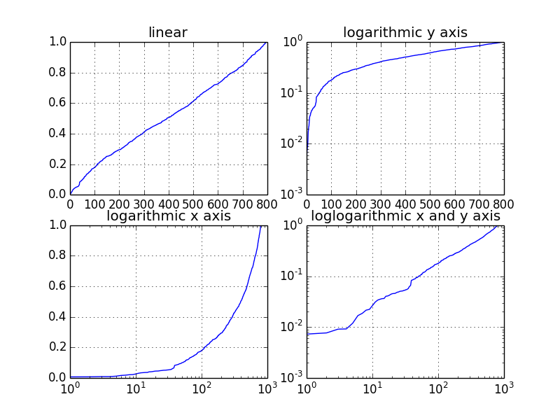
Figure 8: 对数坐标例子
2.6.2. semilogx, semilogy, loglog
除了上节介绍的方法外,使用 semilogx, semilogy, loglog 也能实现 x 轴/y 轴/xy 轴对数坐标画图。图 8 所示图片也可由下面代码生成。
# -*- coding: utf-8 -*-
import numpy as np
import matplotlib.pyplot as plt

# Fixing random state for reproducibility
np.random.seed(19680801)

# make up some data in the interval ]0, 1[
y = np.random.normal(loc=0.5, scale=0.4, size=1000)
y = y[(y > 0) & (y < 1)]
y.sort()
x = np.arange(len(y))

# linear
plt.subplot(221)
plt.plot(x, y)
plt.title('linear')
plt.grid(True)

# logarithmic y axis
plt.subplot(222)
plt.semilogy(x, y)                   # 设置y轴为对数坐标
plt.title('logarithmic y axis')
plt.grid(True)

# logarithmic x axis
plt.subplot(223)
plt.semilogx(x, y)                   # 设置x轴为对数坐标
plt.title('logarithmic x axis')
plt.grid(True)

# logarithmic x and y axis
plt.subplot(224)
plt.loglog(x, y)                     # 设置x轴和y轴都为对数坐标
plt.title('loglogarithmic x and y axis')
plt.grid(True)

plt.show()
2.7. 各种类型的图
2.7.1. 直方图(hist)
下面是使用 hist 画直方图的例子。
#!/usr/bin/env python
# -*- coding: utf-8 -*-

import matplotlib.pyplot as plt
import numpy as np

x = np.random.randn(10000)

plt.hist(x, bins=100, facecolor='r', alpha=0.3)       # 画直方图,100表示竖箱子个数

plt.title(r'Normal distribution with $\mu=0, \sigma=1$')

plt.savefig('matplotlib_histogram.png')
plt.show()
生成的图片如图 9 所示。
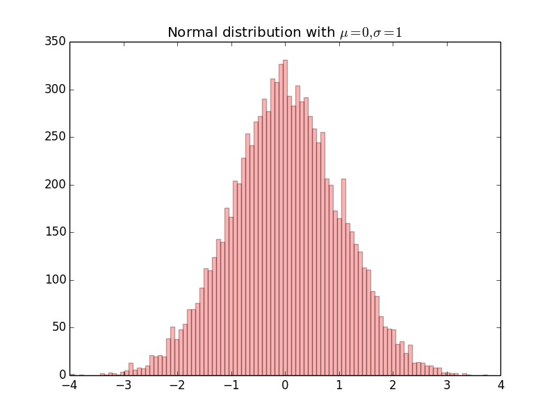
Figure 9: 直方图实例
2.7.2. 条形图(bar)
下面是使用 bar 画条形图的例子。
#!/usr/bin/env python
# -*- coding: utf-8 -*-

from matplotlib.ticker import FuncFormatter
import matplotlib.pyplot as plt

x = [0, 1, 2, 3]
money = [1.5e5, 2.5e6, 5.5e6, 2.0e7]

def millions(x, pos):
    'The two args are the value and tick position'
    return '$%1.1fM' % (x*1e-6)

formatter = FuncFormatter(millions)

fig, ax = plt.subplots()
ax.yaxis.set_major_formatter(formatter)

plt.bar(x, money)       # 画条形图

plt.xticks(x, ('Bill', 'Fred', 'Mary', 'Sue'))

plt.show()
生成的图片如图 10 所示。
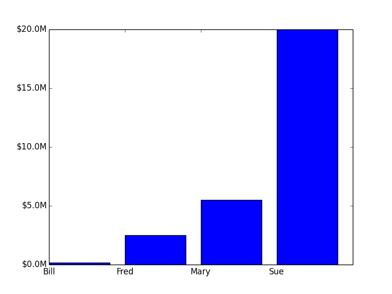
Figure 10: 条形图实例
2.7.3. 饼图(pie)
下面是使用 pie 画饼图的例子。
#!/usr/bin/env python
# -*- coding: utf-8 -*-

import matplotlib.pyplot as plt

# Pie chart, where the slices will be ordered and plotted counter-clockwise:
labels = 'Frogs', 'Hogs', 'Dogs', 'Logs'
sizes = [15, 30, 45, 10]
explode = (0, 0.1, 0, 0)  # only "explode" the 2nd slice (i.e. 'Hogs')

plt.pie(sizes, explode=explode, labels=labels, autopct='%1.1f%%',
        shadow=True, startangle=90)

plt.axis('equal')  # increments of x and y have the same length. 如果不设置plt.axis('equal'),则饼图是椭圆,而不是正圆

plt.show()
生成的图片如图 11 所示。
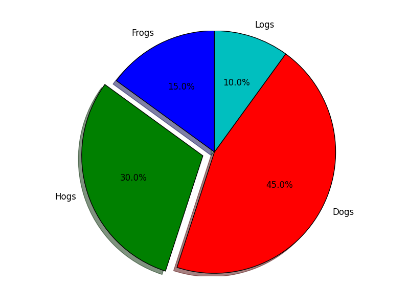
Figure 11: 饼图实例
3. Artist 对象
Matplotlib API 有三层:
(1) backend_bases.FigureCanvas : 最底层
(2) backend_bases.Renderer : 中间层
(3) artist.Artist : 高层
其中,FigureCanvas 和 Renderer 处理底层的绘图操作,例如使用 wxPython 在界面上绘图;Artist 处理所有的高层结构,例如处理图表、文字和曲线等的绘制和布局。 通常我们只和 Artist 打交道,而不需要关心底层的绘制细节。
Artists 分为简单类型(primitives)和容器类型(containers)两种。简单类型的 Artists 为标准的绘图元件,例如 Line2D、Rectangle、Text、AxesImage 等属于简单类型。而容器类型则可以包含许多简单类型的 Artists,使它们组织成一个整体,例如 Axis、Axes、Figure 等属于容器类型。
参考:
Artist tutorial: http://matplotlib.org/users/artists.html#artist-tutorial
http://old.sebug.net/paper/books/scipydoc/matplotlib_intro.html#artist
3.1. 使用 Artists 创建图表
直接使用 Artists 创建图表的流程如下:
(1) 创建 Figure 对象(一个 Figure 对象对应一个图形窗口);
(2) 创建 Axes 对象(一个 Axes 对象可以看作是一个拥有自己坐标系统的绘图区域)。有两种方式,方式一:在 Figure 对象上调用 add_axes 方法创建 Axes 对象;方式二:在 Figure 对象上调用 add_subplot 方法创建 AxesSubplot(它是 Axes 的子类)对象;
(3) 调用 Axes 对象的方法创建各种简单类型的 Artists。
3.1.1. 在 Figure 对象上创建 Axes 对象
3.1.1.1. 使用 add_axes 创建 Axes 对象
下面是使用 add_axes 画图的例子(下面这种风格称为 object-oriented plot)。
# -*- coding: utf-8 -*-
import matplotlib.pyplot as plt

fig = plt.figure()

# first axes
ax1    = fig.add_axes([0.1, 0.1, 0.2, 0.2])   # [left, bottom, width, height] 表示所创建的Axes对象相对于fig的位置和大小,取值在0到1之间
line,  = ax1.plot([0,1], [0,1])
ax1.set_xlabel("x")
ax1.set_ylabel("y")
ax1.grid(True)         # 显示网格
ax1.set_title("ax1")

# second axes
ax2    = fig.add_axes([0.4, 0.3, 0.4, 0.5])   # [left, bottom, width, height] 表示所创建的Axes对象相对于fig的位置和大小,取值在0到1之间
sca    = ax2.scatter([1,3,5], [2,1,1.8])
ax2.set_xlabel("x")
ax2.set_ylabel("y")
ax2.set_title("ax2")

plt.show()
生成的图片如图 12 所示。
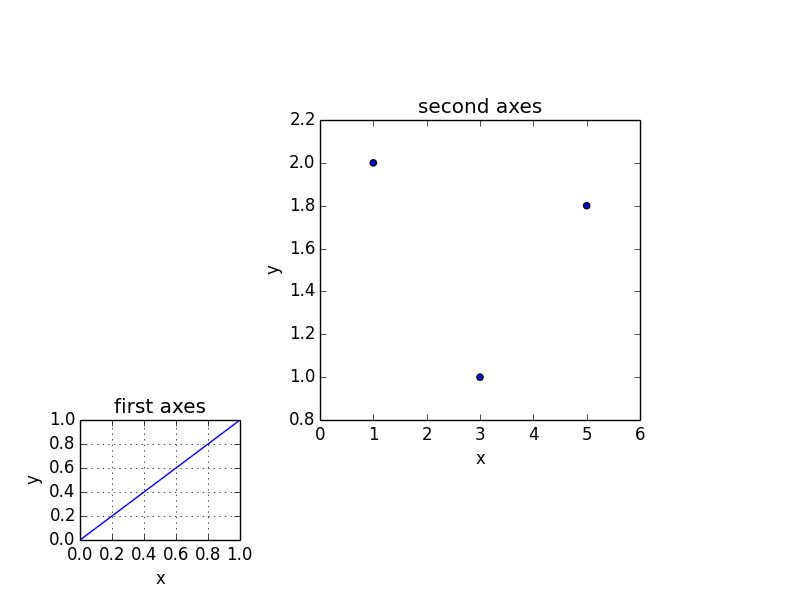
Figure 12: add_axes 画图实例
3.1.1.2. 使用 add_subplot 创建 Axes 对象
下面是使用 add_subplot 画图的例子。
# -*- coding: utf-8 -*-
import numpy as np
import matplotlib.pyplot as plt

fig = plt.figure()
fig.subplots_adjust(top=0.8)
ax1 = fig.add_subplot(211)             # 第一个Axes对象

t = np.arange(0.0, 1.0, 0.01)
s = np.sin(2*np.pi*t)
line, = ax1.plot(t, s, color='blue', lw=2)
ax1.set_ylabel('volts')
ax1.set_title('a sine wave')

# Fixing random state for reproducibility
np.random.seed(19680801)

ax2 = fig.add_subplot(212)              # 第二个Axes对象
n, bins, patches = ax2.hist(np.random.randn(1000), 50, facecolor='yellow', edgecolor='yellow')  # 画直方图
ax2.set_xlabel('time (s)')

plt.show()
生成的图片如图 13 所示。
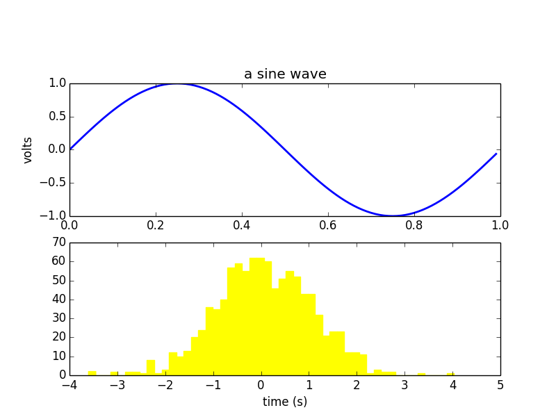
Figure 13: add_subplot 画图实例
3.1.2. 在 Axes 对象上创建 Artists 对象的各种方法(fill,hist,plot,scatter,etc.)
| Helper method | 说明 | 所创建的 Artist 对象 | Container |
|---|---|---|---|
| ax.annotate | text annotations | Annotate | ax.texts |
| ax.bar | bar charts | Rectangle | ax.patches |
| ax.errorbar | error bar plots | Line2D and Rectangle | ax.lines and ax.patches |
| ax.fill | shared area | Polygon | ax.patches |
| ax.hist | histograms | Rectangle | ax.patches |
| ax.imshow | image data | AxesImage | ax.images |
| ax.legend | axes legends | Legend | ax.legends |
| ax.plot | xy plots | Line2D | ax.lines |
| ax.scatter | scatter charts | PolygonCollection | ax.collections |
| ax.text | text | Text | ax.texts |
3.1.3. 定制 Artists 对象的表现形式
可以通过修改 Artists 对象的属性来定制 Artists 对象的表现形式。
| Property | Description |
|---|---|
| alpha | The transparency - a scalar from 0-1 |
| animated | A boolean that is used to facilitate animated drawing |
| axes | The axes that the Artist lives in, possibly None |
| clip_box | The bounding box that clips the Artist |
| clip_on | Whether clipping is enabled |
| clip_path | The path the artist is clipped to |
| contains | A picking function to test whether the artist contains the pick point |
| figure | The figure instance the artist lives in, possibly None |
| label | A text label (e.g., for auto-labeling) |
| picker | A python object that controls object picking |
| transform | The transformation |
| visible | A boolean whether the artist should be drawn |
| zorder | A number which determines the drawing order |
| rasterized | Boolean; Turns vectors into rastergraphics: (for compression & eps transparency) |
Artist 对象的所有属性都通过相应的 get_* 和 set_* 函数进行读写,例如下面的语句将 alpha 属性设置为当前值的一半:
>>> fig.set_alpha(0.5*fig.get_alpha())
如果你想用一条语句设置多个属性的话,可以使用 set 函数:
>>> fig.set(alpha=0.5, zorder=2)
使用 matplotlib.pyplot.getp 函数可以方便地输出 Artist 对象的所有属性名和值:
>>> plt.getp(fig)
    agg_filter = None
    alpha = None
    animated = False
......
4. 画三维图
The mplot3d toolkit adds simple 3D plotting capabilities to matplotlib by supplying an axes object that can create a 2D projection of a 3D scene.
#!/usr/bin/env python
# -*- coding: utf-8 -*-

import matplotlib.pyplot as plt
from mpl_toolkits.mplot3d import Axes3D

fig = plt.figure()
ax = fig.add_subplot(111, projection='3d')    # 创建Axes3D对象

x = [0, 1, 2, 3]
y = [1, 2, 3, 4]
z = [1, 5, 13, 25]

ax.plot(x, y, z, 'ro')

ax.set_xlim(0,4)     # 设置x坐标轴范围
ax.set_ylim(0,5)     # 设置y坐标轴范围
ax.set_zlim(0,26)    # 设置z坐标轴范围

ax.set_xlabel('x')
ax.set_ylabel('y')
ax.set_zlabel('z')

plt.show()
生成的图片如图 14 所示。
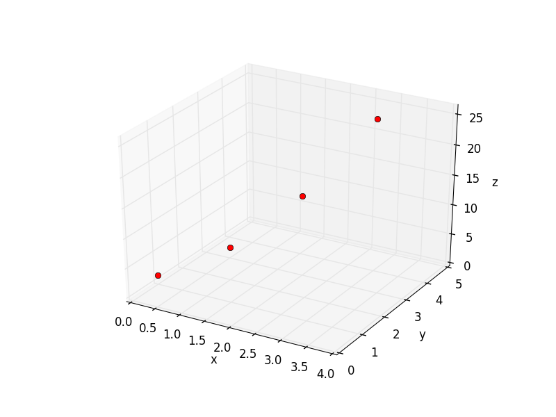
Figure 14: 三维图简单例子
4.1. plot_surface 画曲面图
下面是使用 plot_surface 画 \(z=x^2 + y^2\) 图形的例子。
#!/usr/bin/env python
# -*- coding: utf-8 -*-

from mpl_toolkits.mplot3d import Axes3D
import matplotlib.pyplot as plt
import numpy as np
from matplotlib import cm

fig = plt.figure()
ax = fig.add_subplot(111, projection='3d')

u = np.linspace(-1, 1, 100)
x, y = np.meshgrid(u, u)
z = x ** 2 + y ** 2

ax.plot_surface(x, y, z, rstride=4, cstride=4, cmap=cm.coolwarm) #通过修改cmap可改变颜色风格

ax.set_xlabel(r'$x$')
ax.set_ylabel(r'$y$')
ax.set_zlabel(r'$z$')

ax.set_title(r'$z=x^2 + y^2$')

plt.show()
生成的图片如图 15 所示。
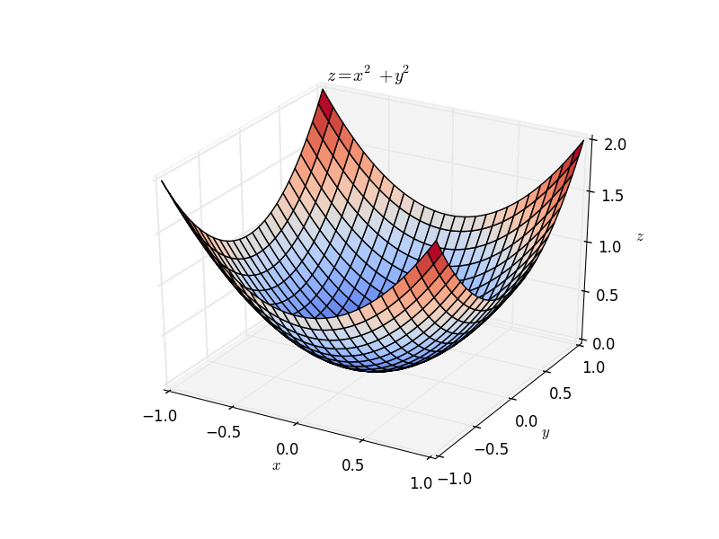
Figure 15: plot_surface 实例 \(z=x^2 + y^2\)
5. 附录
5.1. plot 格式字符串
默认地,用 plot 画第一次图形时会选择风格蓝色实线(即'b-'),画后面图形时会从“style cycle”中选择其它风格。当然你可以定制它们。
| 字符 | 颜色 |
|---|---|
| 'b' | 蓝色 |
| 'g' | 绿色 |
| 'r' | 红色 |
| 'c' | 青色 |
| 'm' | 品红色 |
| 'y' | 黄色 |
| 'k' | 黑色 |
| 'w' | 白色 |
| 字符 | 描述 |
|---|---|
| '-' | 实线样式 |
| '--' | 短横线样式 |
| '-.' | 点划线样式 |
| ':' | 虚线样式 |
| '.' | 点标记 |
| ',' | 像素标记 |
| 'o' | 圆标记 |
| 'v' | 倒三角标记 |
| '^' | 正三角标记 |
| '<' | 左三角标记 |
| '>' | 右三角标记 |
| '1' | 下箭头标记 |
| '2' | 上箭头标记 |
| '3' | 左箭头标记 |
| '4' | 右箭头标记 |
| 's' | 正方形标记 |
| 'p' | 五边形标记 |
| '*' | 星形标记 |
| 'h' | 六边形标记 1 |
| 'H' | 六边形标记 2 |
| '+' | 加号标记 |
| 'x' | X 标记 |
| 'D' | 菱形标记 |
| 'd' | 窄菱形标记 |
| | | 竖直线标记 |
| '_' | 水平线标记 |
下面是格式字符串对应风格的一些测试。
#!/usr/bin/env python
# -*- coding: utf-8 -*-

import matplotlib.pyplot as plt

x = [0, 1, 2, 3]
y0 = [1, 1, 1, 1]
y1 = [2, 2, 2, 2]
y2 = [3, 3, 3, 3]
y3 = [4, 4, 4, 4]
y4 = [5, 5, 5, 5]
y5 = [6, 6, 6, 6]
y6 = [7, 7, 7, 7]
y7 = [8, 8, 8, 8]

plt.plot(x, y0, '<', label='<')
plt.plot(x, y1, 'm>', label='m>')
plt.plot(x, y2, 'r*', label='r*')
plt.plot(x, y3, 'x', label='x')
plt.plot(x, y4, '-.', label='-.')
plt.plot(x, y5, 'go-', label='go-')
plt.plot(x, y6, 's', label='s')
plt.plot(x, y7, 'o', label='o')

plt.xlim(-1, 5)
plt.ylim(0, 10)

plt.legend()
plt.show()
生成的图片如图 16 所示。
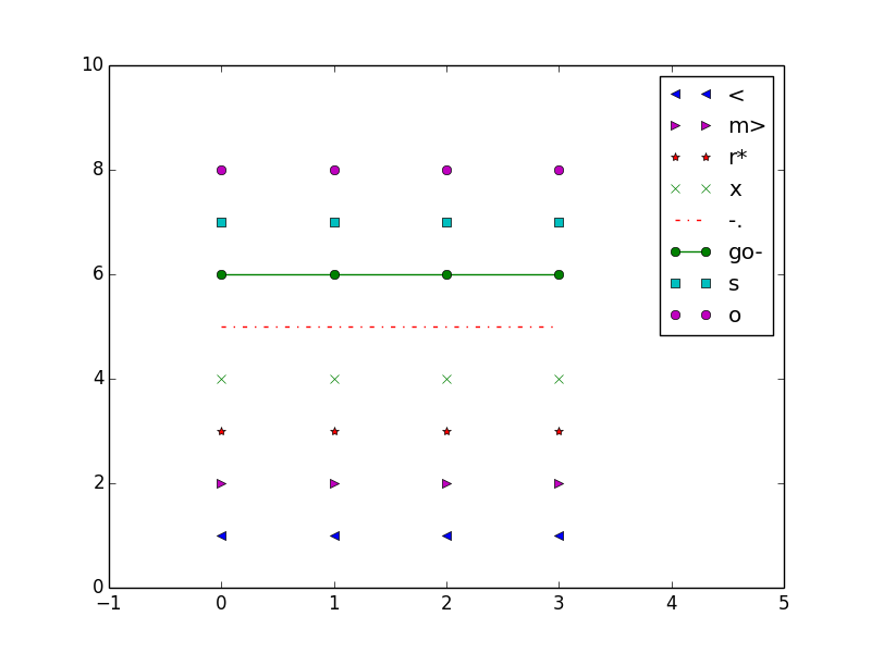
Figure 16: plot 不同格式字符串对应风格
参考:http://matplotlib.org/api/pyplot_api.html#matplotlib.pyplot.plot